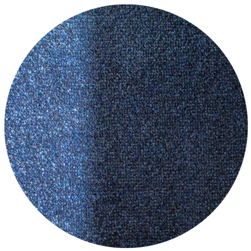
Your eyes aren't playing tricks on you, it could be your lighting.
The type of lighting in your space can make your ColorStar mat look lighter or darker and give it a blue, orange or green tint. Even the time of day or the weather can alter how your mat appears. To show you what we mean, we've taken a ColorStar Botanical and photographed it in three common light settings.
The Play of Light
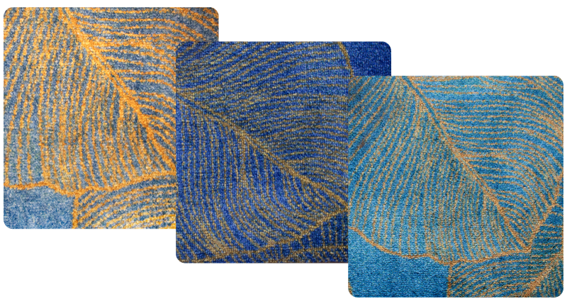
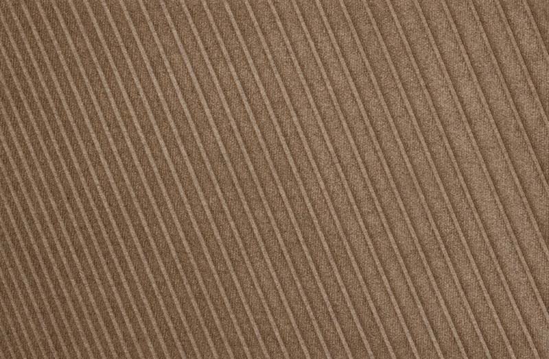
How Recycled PET reflects light
Our ColorStar mats are crafted from recycled PET yarns that reflect light in a distinctive and dynamic way. The appearance of each mat subtly shifts based on the angle and height from which it is viewed, providing a constantly evolving visual experience.
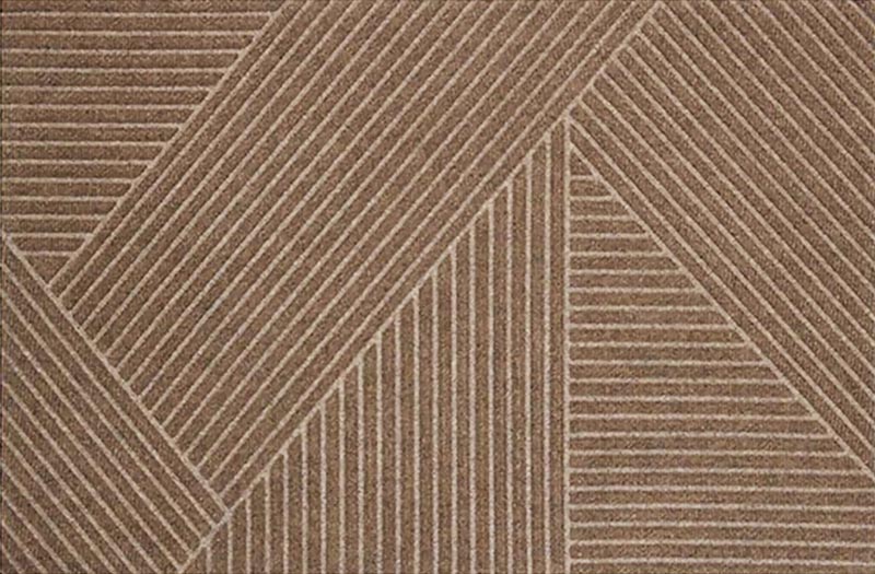
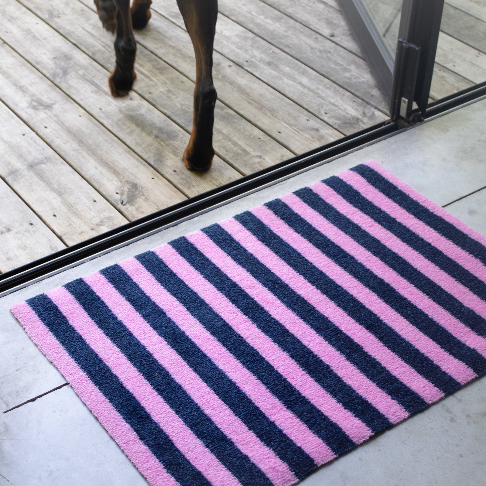
The Play of Yarns
A Multi-Dimensional Aesthetic
A mat is more than just a flat rectangle. It's a multi-dimensional texture that interacts with the light and movements of your home. Similar to how velvet shifts in appearance when touched, the yarns in our mats reflect light differently depending on their orientation. As a result, the mat's colour can subtly change, influenced by the direction and placement of the yarns.
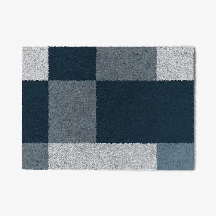
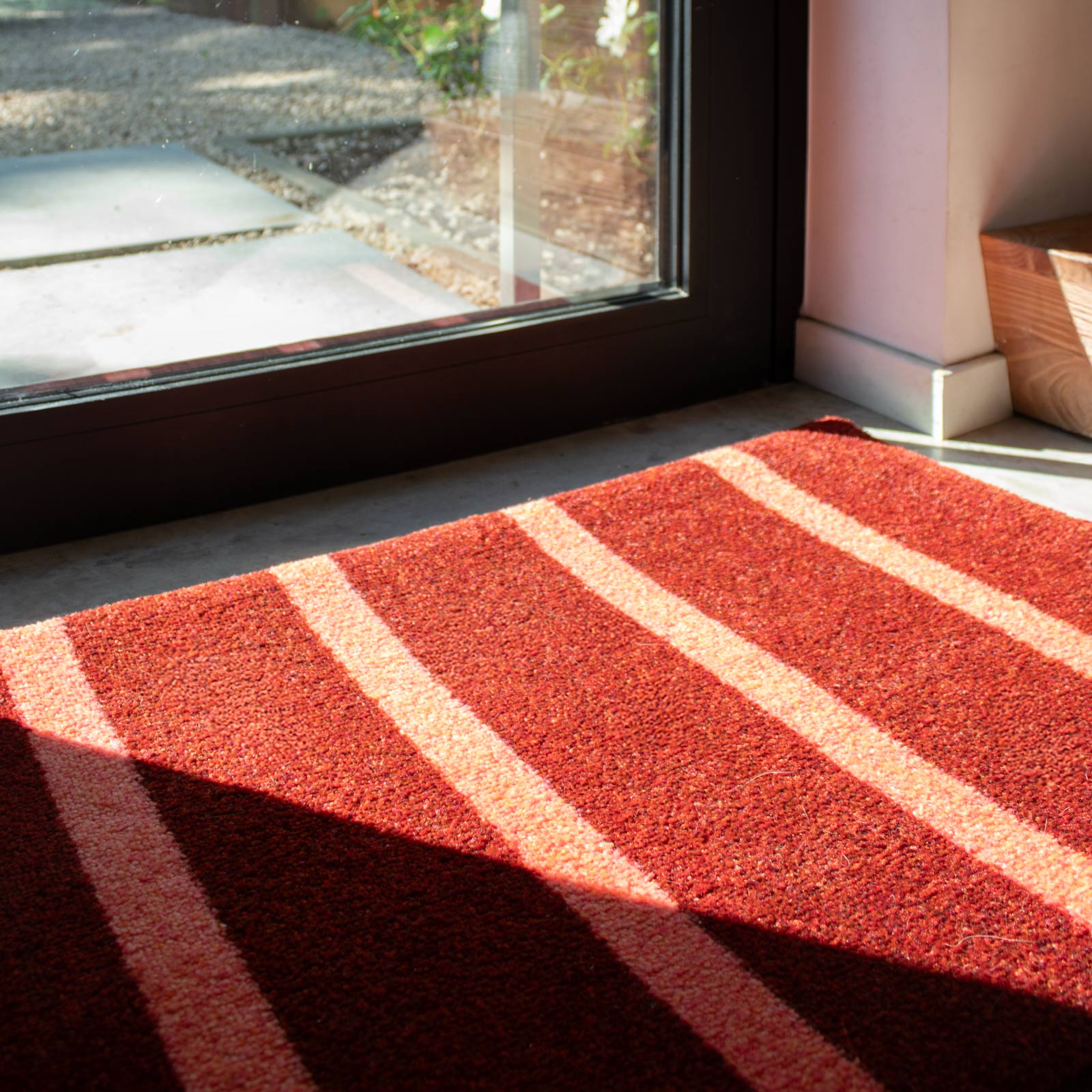
The play of contrast
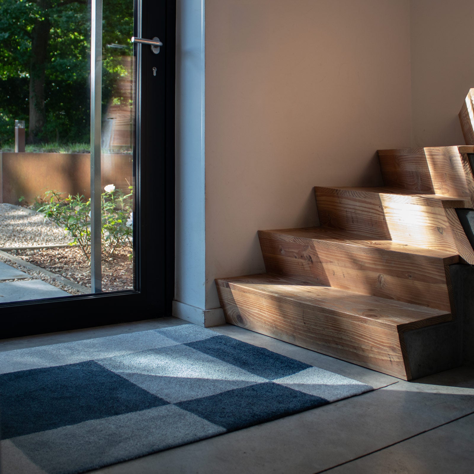
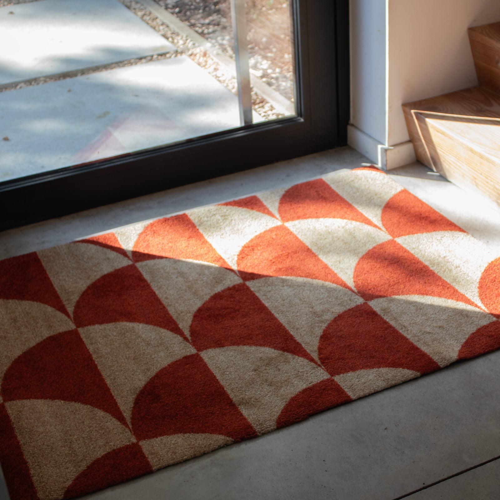
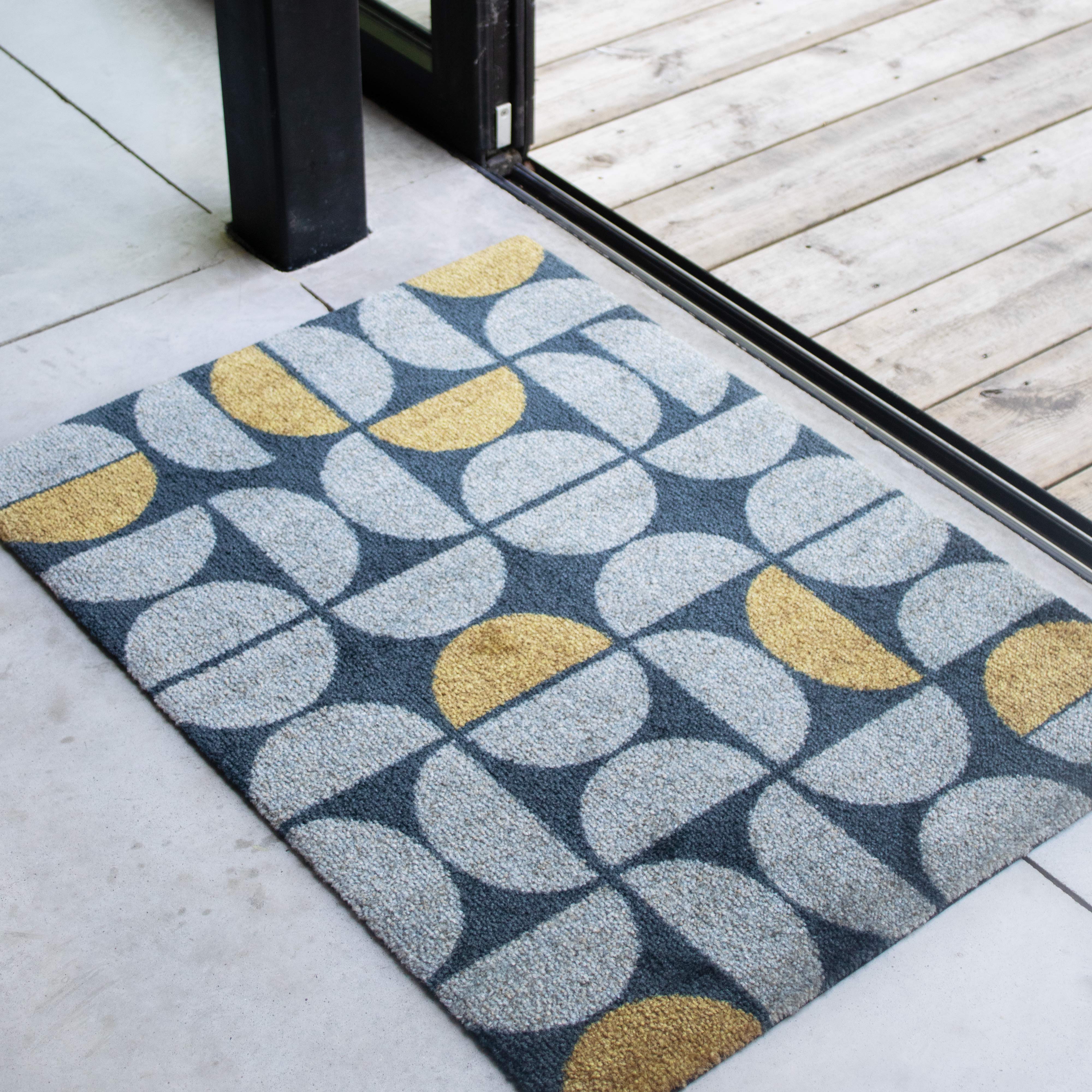
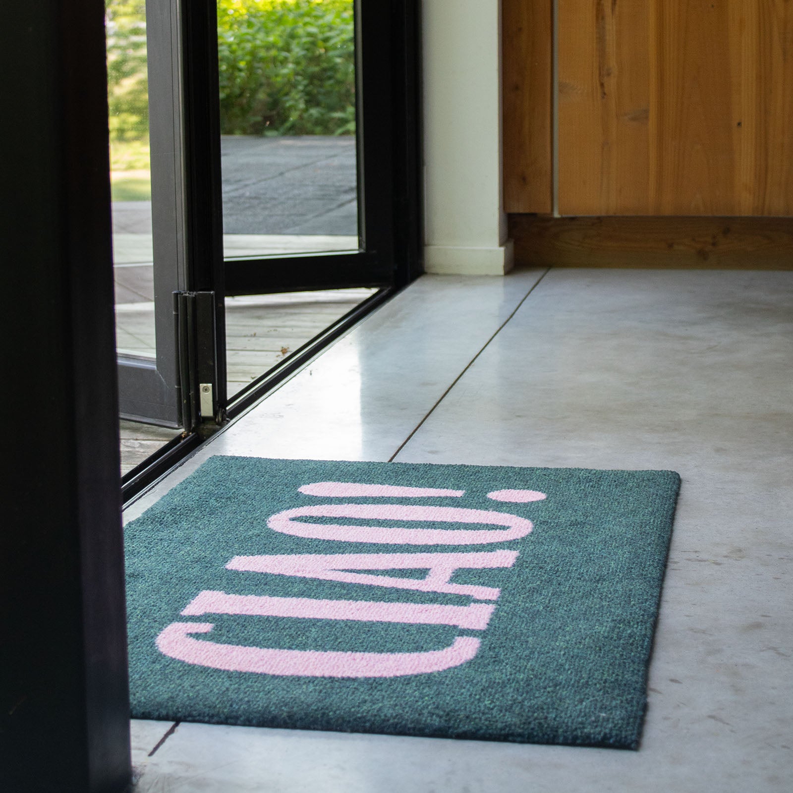
How your floor affects the colour of your mat
This effect is due to the way light interacts with both the mat and the surrounding floor. Darker floors tend to make mat colours appear more vibrant, and vice versa.
Additionally, the contrast between the mat and the floor can alter how we interpret the hue and brightness of the mat. If you want the mat to stand out or blend in seamlessly with your space, it's important to consider the floor colour when choosing a mat colour for your home or business.
Need help?
Frequently Asked Questions
As all our mats are designed to be stain & fade resistant, there is no bad choice. However, certain colours may have practical or aesthetic benefits, such as:
- Darker colours can hide dirt and stains better, making them ideal for high-traffic areas or outdoor use.
- Bright or light-coloured mats may need more frequent cleaning, but they can brighten up a space or create a fresh, airy look.
- Contrast: Dark mats on light floors create bold contrast, while light mats on dark floors look bright. Similar colours make the mat blend in.
- Warm vs. Cool Tones: Warm floors can dull cool mats, while cool floors enhance warm mats.
- Glossy vs. Matte: Glossy floors make colours brighter, while matte floors soften them.
Yes, the colour of a mat can definitely influence the mood and energy in a room. Colours have psychological effects and can evoke different emotions and feelings. For example:
- Warm colours like red, orange, and yellow can create a vibrant, energetic atmosphere, promoting warmth and creativity.
- Cold colours such as blue, green, and purple tend to be calming and soothing, making them perfect for spaces meant for relaxation or focus.
- Neutral colours like beige, gray, or white can bring balance and harmony, providing a versatile backdrop that complements various design styles.
By choosing a mat in a colour that aligns with the desired ambiance of your room, you can enhance the overall atmosphere and create a space that feels just right for you.
Some of our yarns, such as ColorStar Sea Turquoise and Earth Greige, are crafted by blending multiple colours together. This design choice makes it easier for the mat to complement your interior, as the mix of colours offers greater versatility, allowing the mat to harmonize with a wider range of home decor styles compared to a single, solid colour.
As mentioned earlier, the colour of your mat can be influenced by surrounding colours, lighting, the angle from which you view it, and the way the yarns are laid. To help the yarns maintain their natural texture and prevent them from lying flat, we recommend washing your ColorStar mat before placing it. Before deciding to return it, take some time to explore your mat - rotate it, view it from different angles, and allow yourself a few days to adjust to its unique beauty in your space.
If you're still not convinced, then you can claim your 100% satisfaction guarantee.
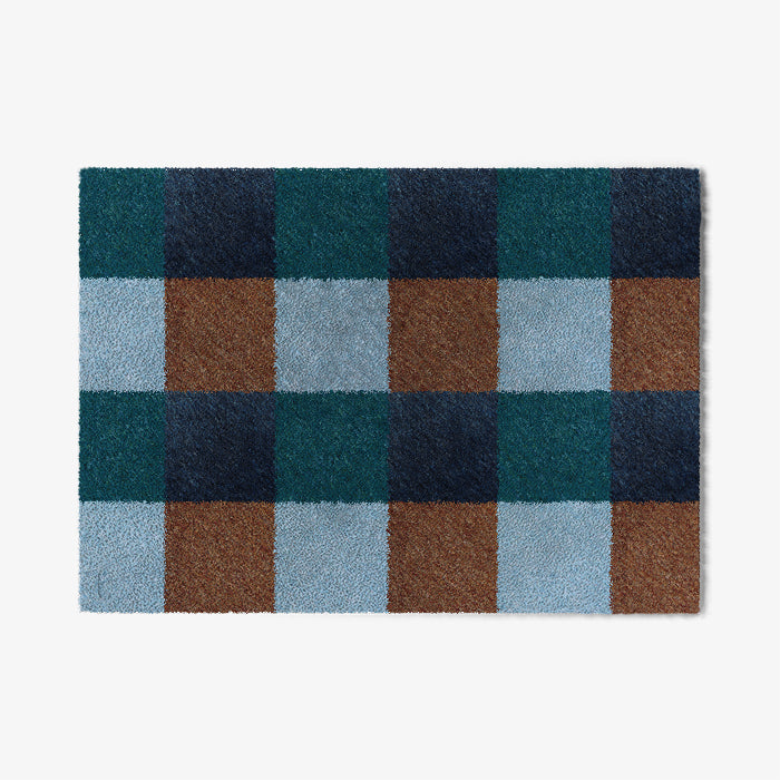
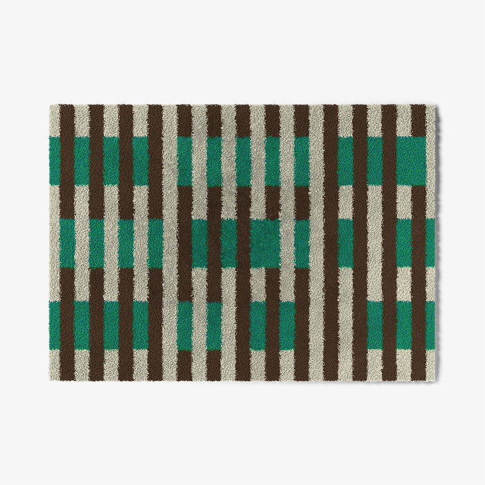
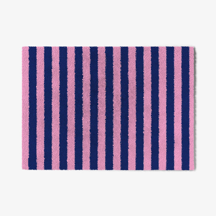
Featured collection
ColorStar Premium Indoor Mats
100% Satisfaction Guarantee
Free Shipping From € 75

Easy Returns